Harland & Wolff
Repositioning one of the world's oldest and most famous shipbuilding brands
Harland & Wolff
Shipbuilding & Engineering, UK
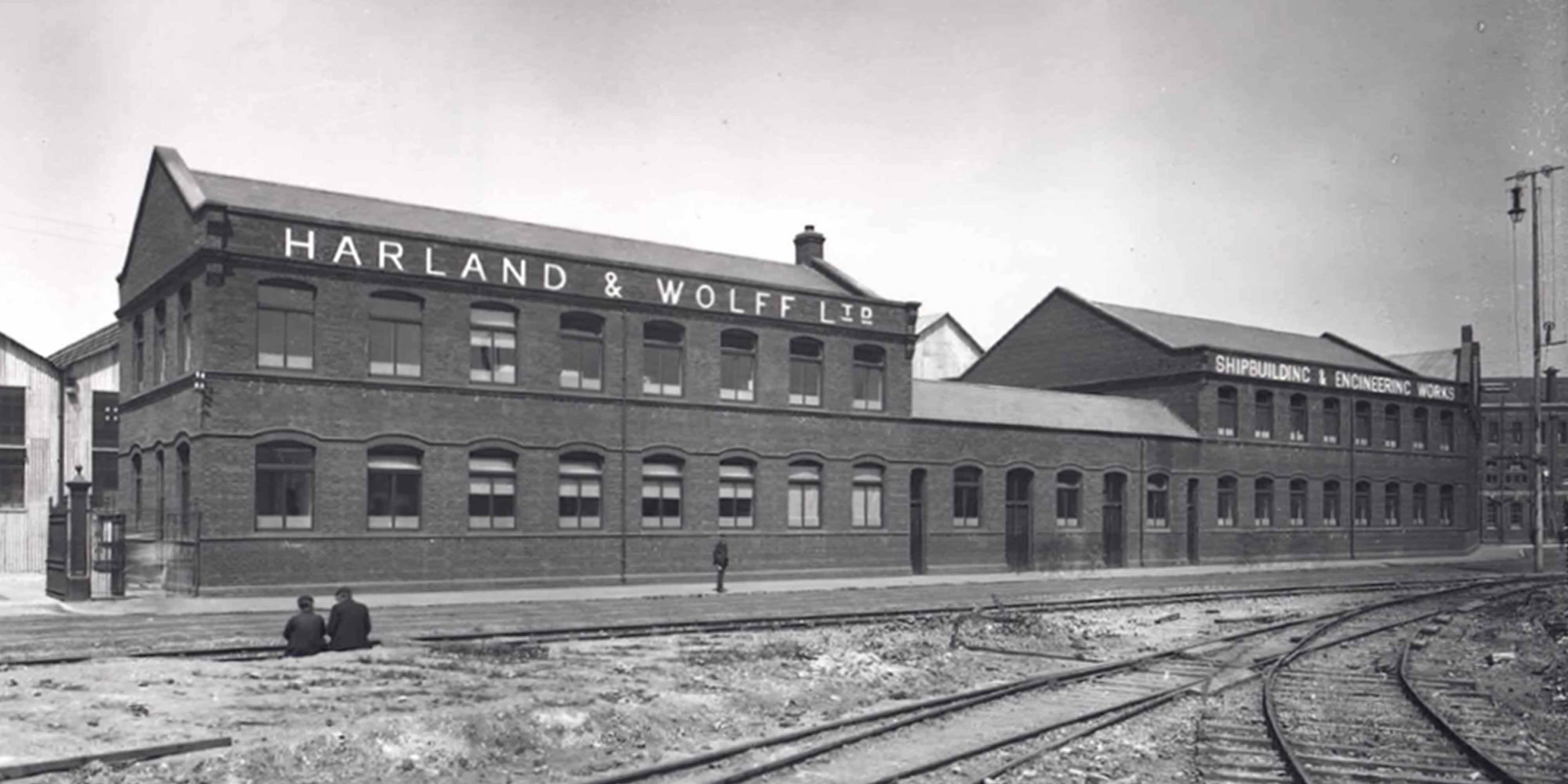
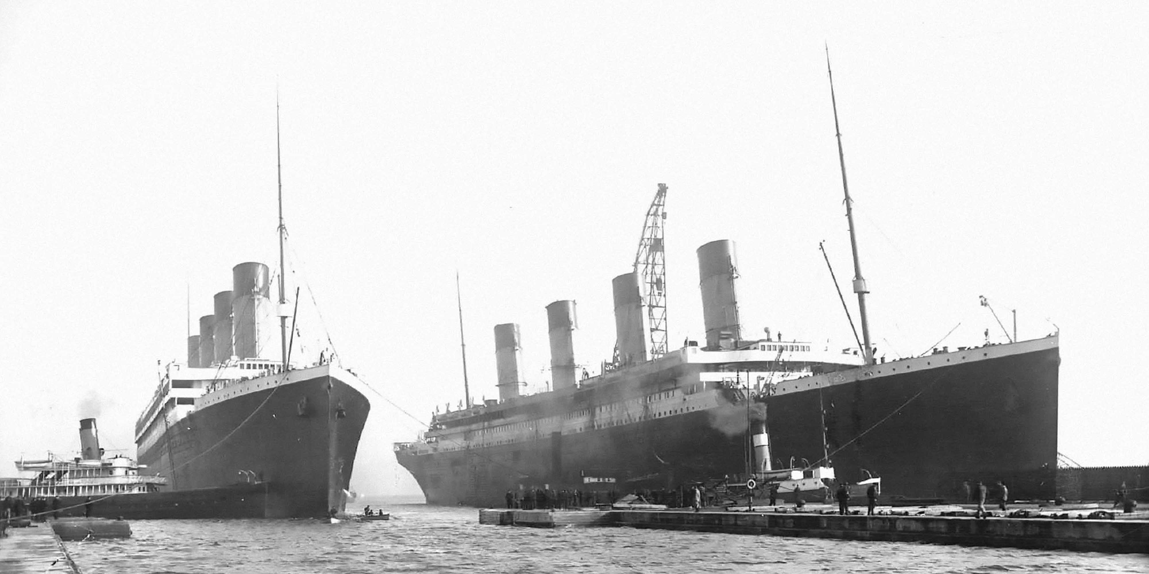
Harland & Wolff was founded in 1861 by Sir Edward Harland and Gustav Wolff. The Belfast-based shipbuilder is steeped in history and heritage, famed for building vessels including RMS Titanic, RMS Olympic and HMHS Britannic, to the SS Canberra, HMS Belfast, and the Myrina — the first supertanker built in the UK. From its earliest days, success has been attributed to introducing innovations that have disrupted the industry.
When we engaged with the business in 2019, it had been rescued from decades of decline and financial instability. With priorities focused on corporate survival, the brand had suffered significant neglect and was essentially adrift in a fearlessly competitive and technology driven industry. It was immediately apparent that this famous name existed only through inconsistent, randomly applied marks, some incorporating a monogram, with no strategy or consideration for the overall design system, aesthetic, or market differentiation.
Our work has resulted in a modern, yet heritage-sensitive identity and design system that has proven fundamental in transforming the business, driving growth and momentum, and unlocking a bright new future. The new visual identity is a powerful symbol of the strength, pride, and resilience of the Harland & Wolff workforce, alumni, local communities, and the UK maritime industry.
Client
Harland & Wolff
Services
Brand strategy
Brand architecture
Visual identity
Brand guidelines
Editorial design
Print design
Digital design
Wayfinding
Exhibition design
Vehicle design
Motion design
Employee communications
Advertising


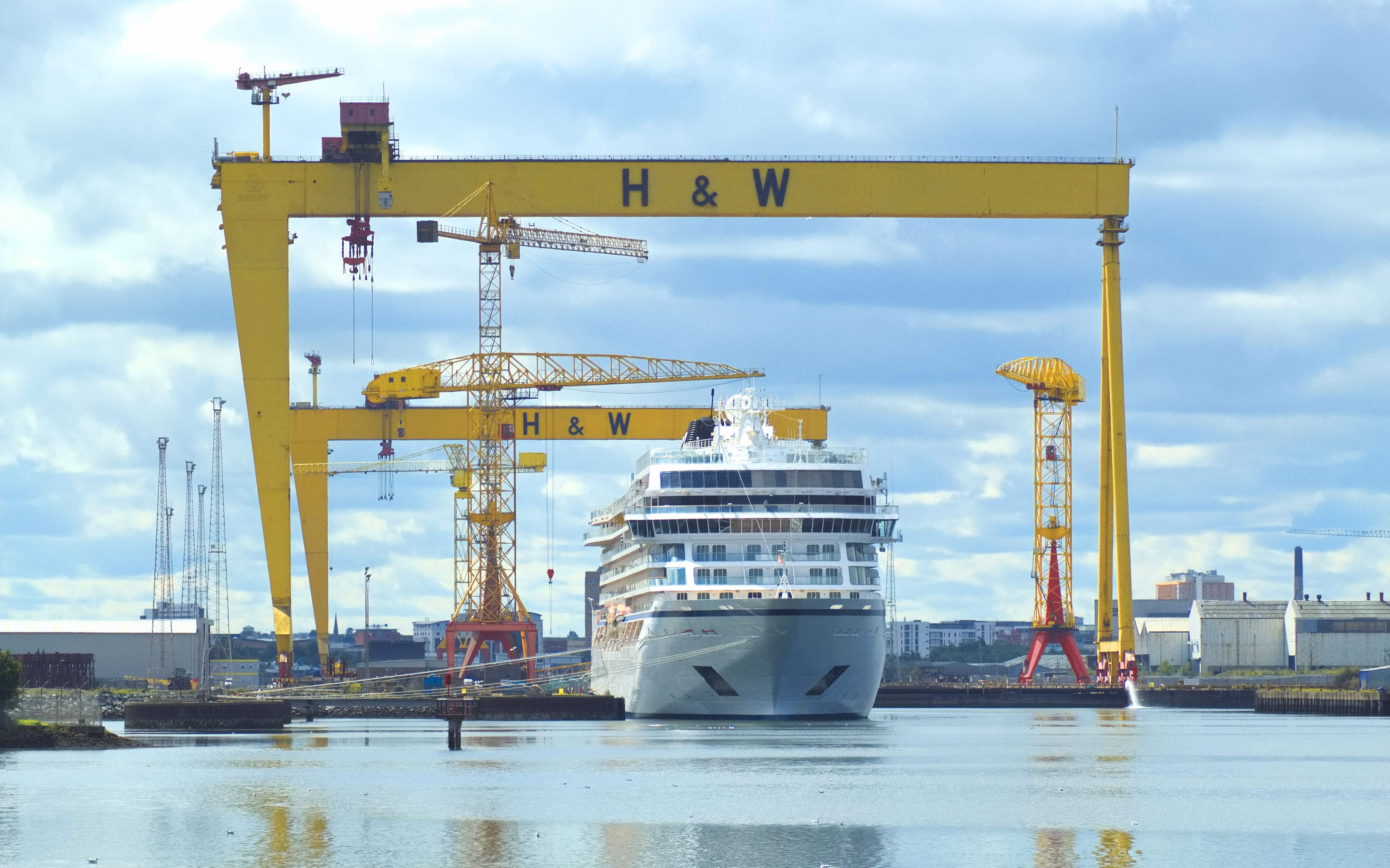
The monogram has evolved little over the last 160 years or so. At a glance, it is formed of 'H' and 'W'. It could be interpreted as a ship's hull with scaffolding towering above. In modern times, perhaps the crossbar of the 'H' could represent one of the two gantry cranes (Samson and Goliath) that dominate their famous Belfast shipyard and skyline, with a dock and / or a ship's hull beneath.
Variations can be seen on numerous structures, vessels and products manufactured by H&W over the last century and a half, to murals painted in several Belfast streets. Though given carte blanche, we recommended that this historic element be retained and incorporated within the new visual identity as an important link to the past as well as acknowledgment of the local community and the warmth held for it. With a great deal of creative thinking and iterative design, we evolved its use to further complement the overall design system as well as smaller aesthetic details.
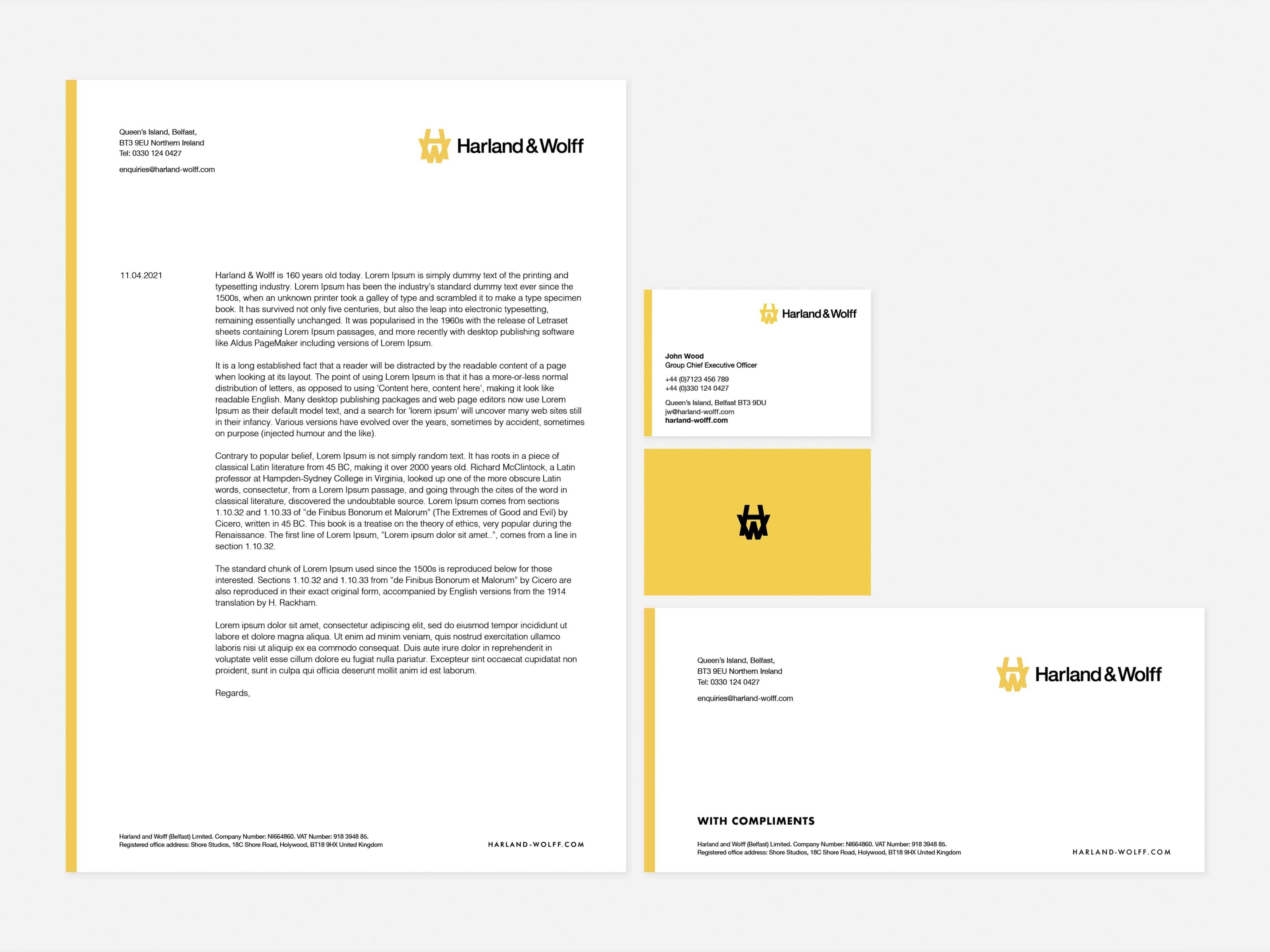
Having elected to retain the 1990's monogram, it was redrawn by our team and partnered with a timeless wordmark typeset and structured to give an air of strength, heritage, and impeccable craftsmanship. Consideration was given to the iconic Belfast cranes and use of the ampersand to acknowledge the recent past, and a modern and visually pleasing balance. Angles of the ampersand as well as the 'W' of Wolff intentionally set to reflect and complement the monogram.

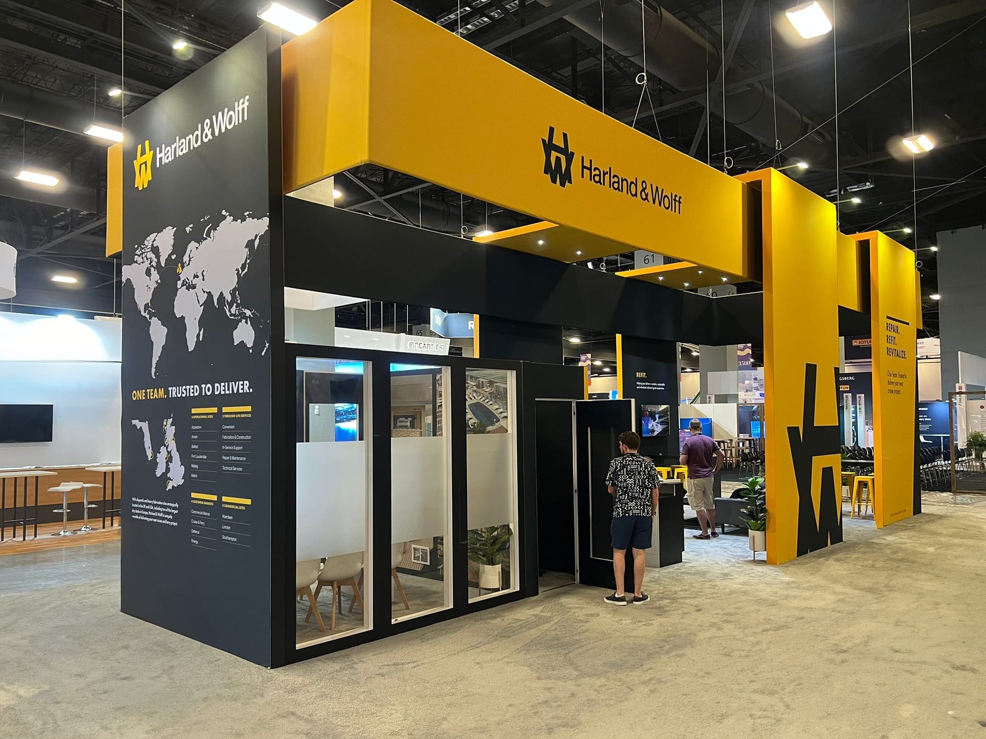
The overall aesthetic is as impactful as it is elegant, paying tribute to its incredible heritage yet feeling modern and fit for the decades to come, from attracting and retaining highly skilled people, investing in the next generation, to winning new contracts and growth through continued investment and momentum. Applied across uniforms, vehicles, signage, print, digital, exhibition, film and motion graphics, the new visual identity had to perform across a multitude of platforms and reflects a forward-looking business with a bright future.

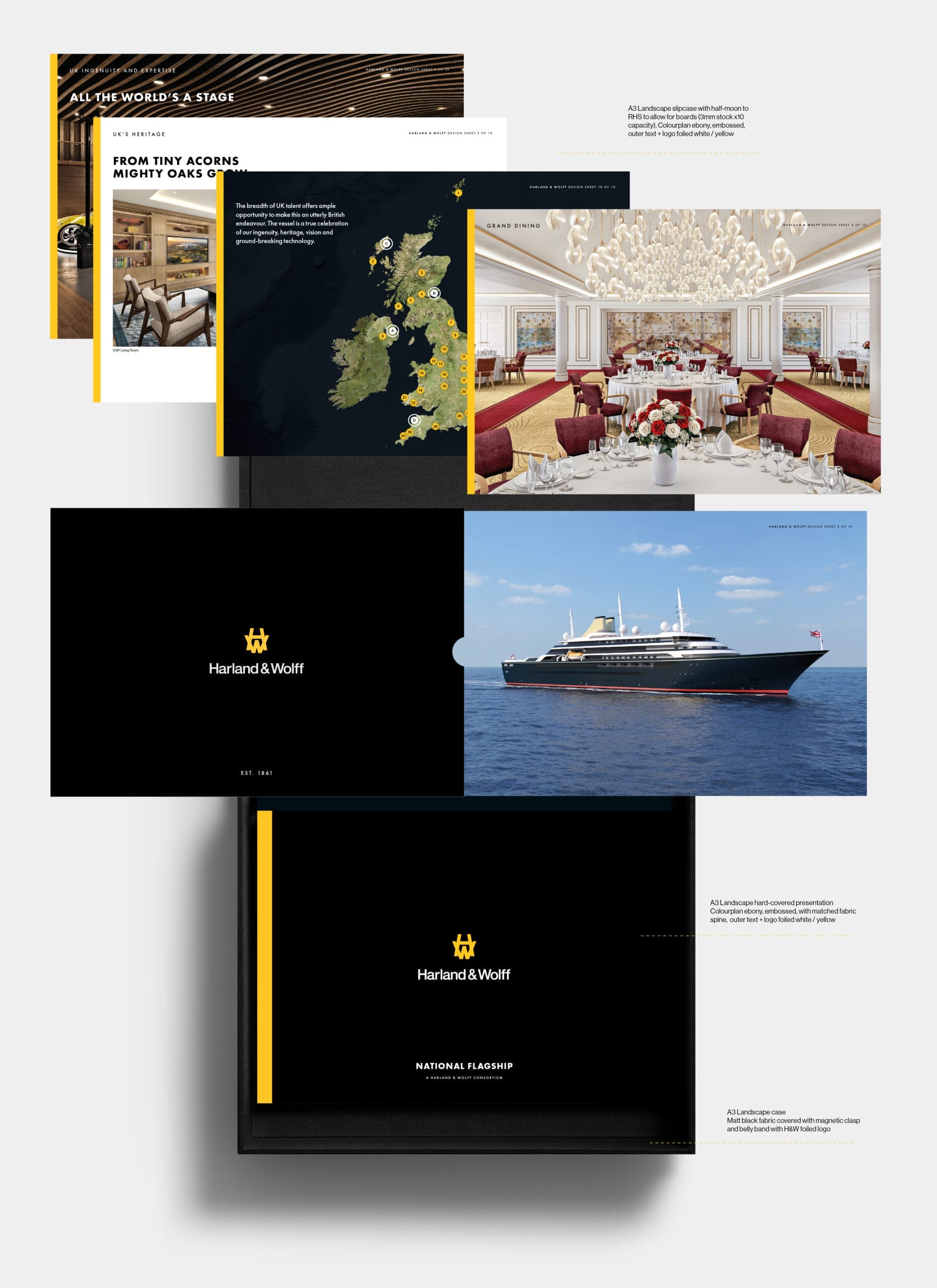
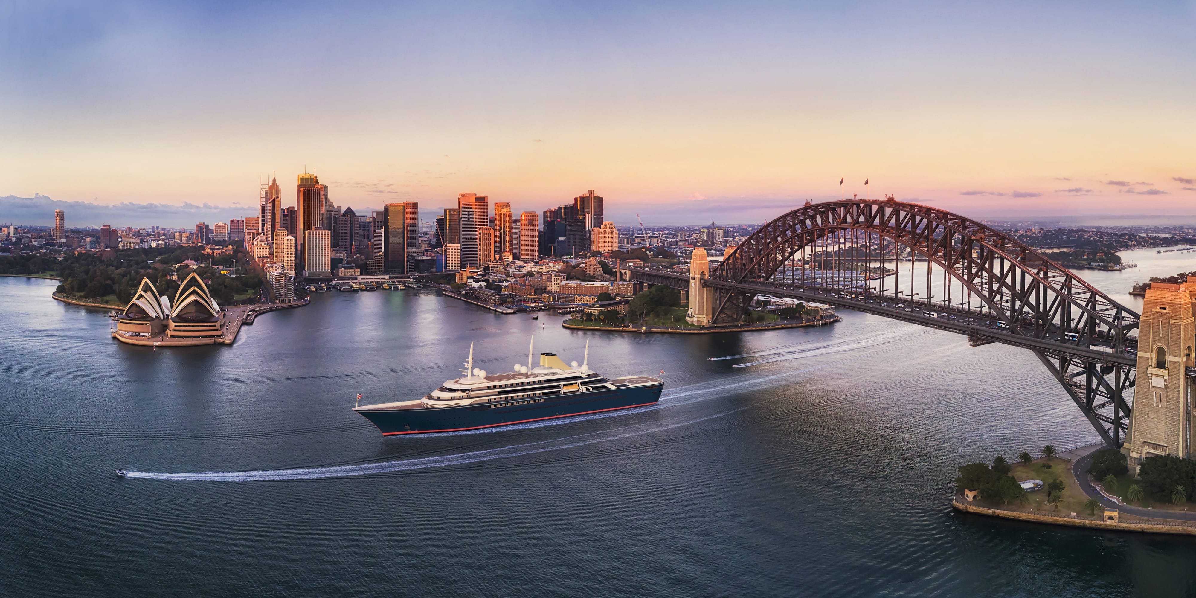
National Flagsip. Our team devised a presentation system with maximum impact in support of Harland & Wolff's bid to design and build a successor to the Royal Yacht Britannia — a competition with a £250m budget named National Flagship. With shortlisted bid material potentially being reviewed by the UK Prime Minister as well as senior members of the British Royal Family, we encouraged an old-school approach consisting of a very high specification A3 landscape pack containing a presentation book and a tactile set of design boards, all encased into an equally impressively designed case. This substantial pack weighed in at several kilograms, with every detail considered, no matter how small. The programme was scrapped by the subsequent government. Renders: SMC

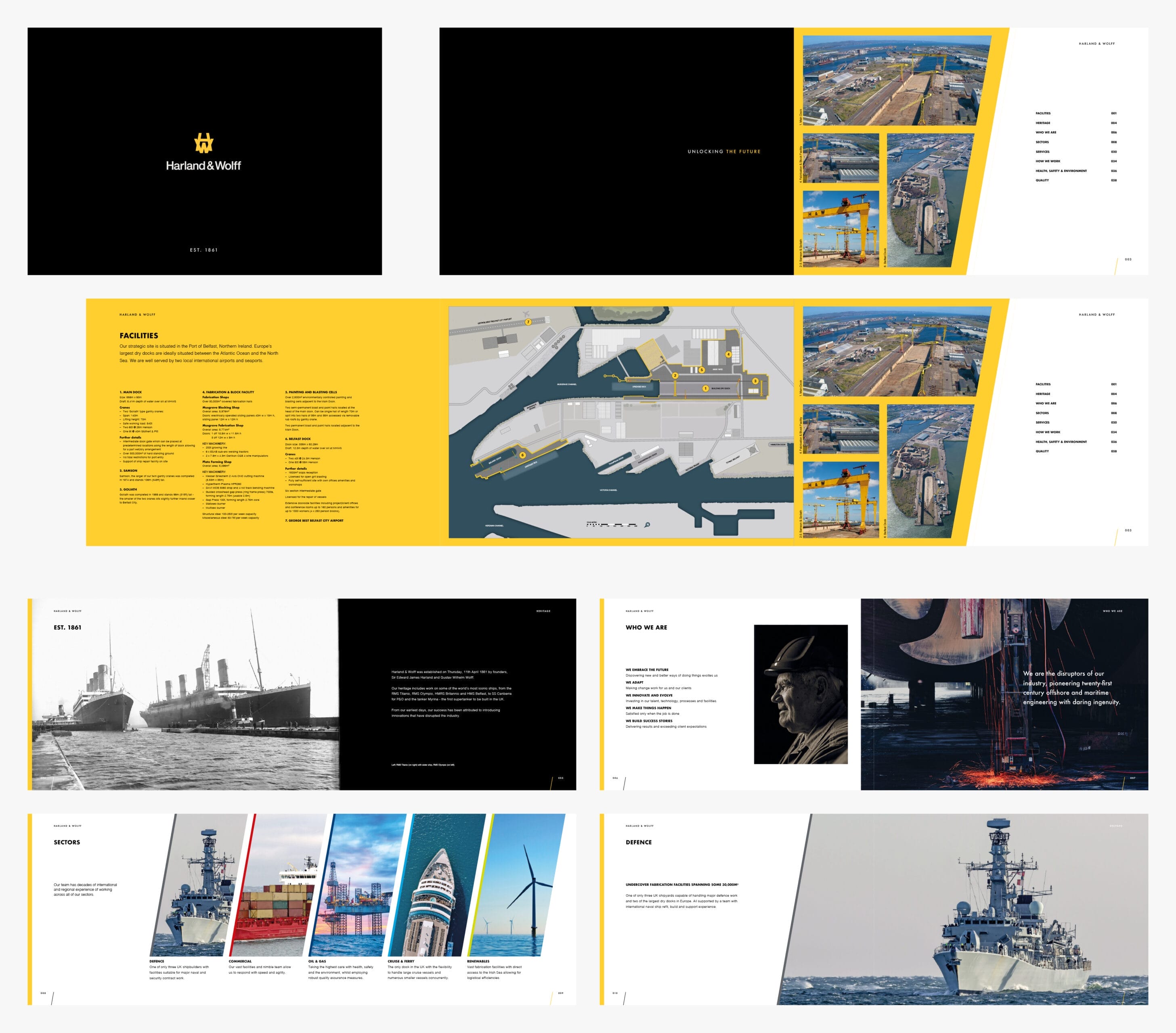
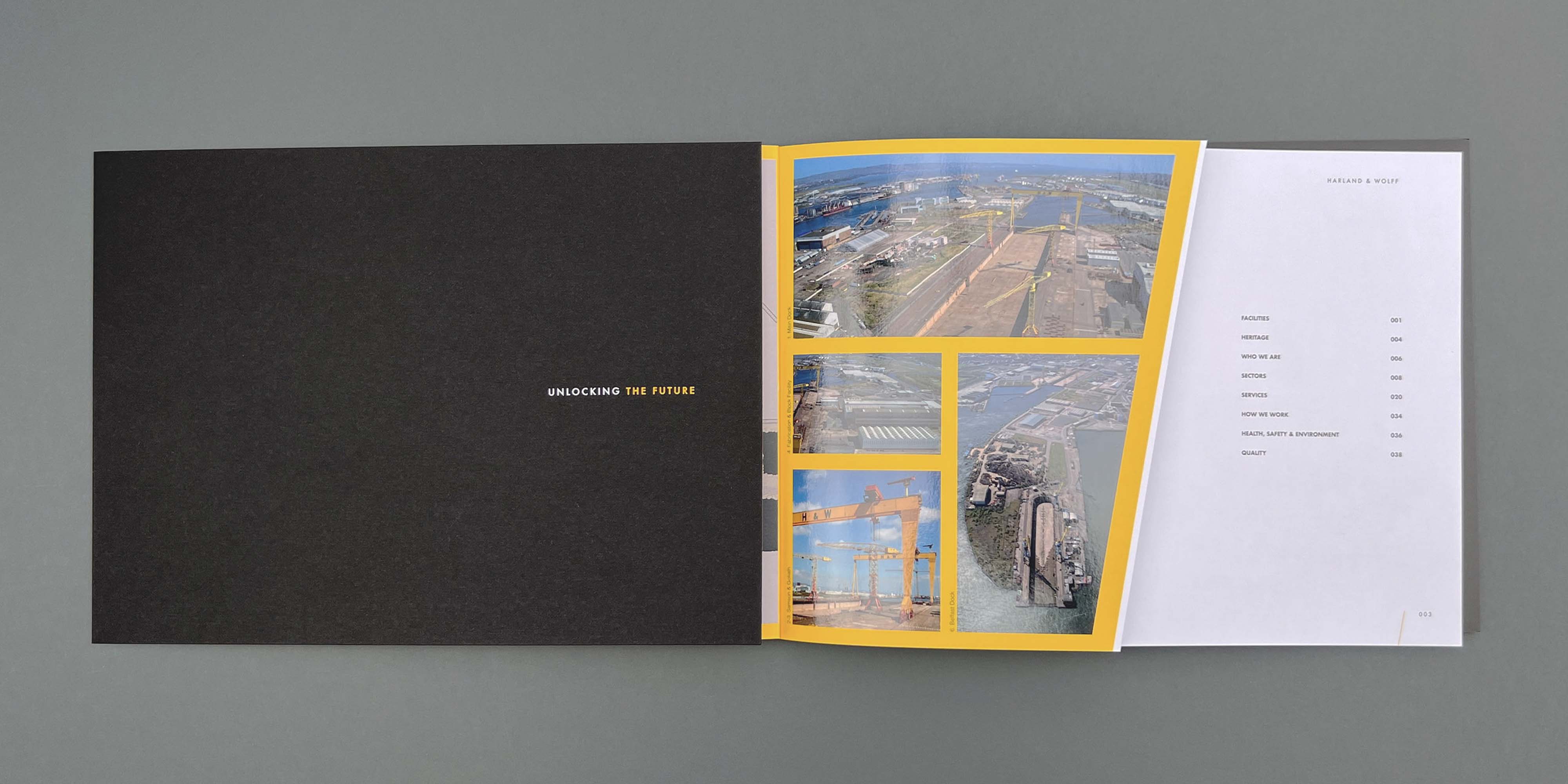
Corporate brochures. From the outset, we conceived, designed and specified brochures and tangible items to the highest specifications to reflect the quality, expertise and attention to detail of Harland & Wolff. The initial brochure featured a detailed plan of their Belfast shipyard across a fold-out inside cover. Further assets were incorporated into later versions as acquired to show the scale and capability of this industry icon as well as sector specific variants to support targeted events and business development.

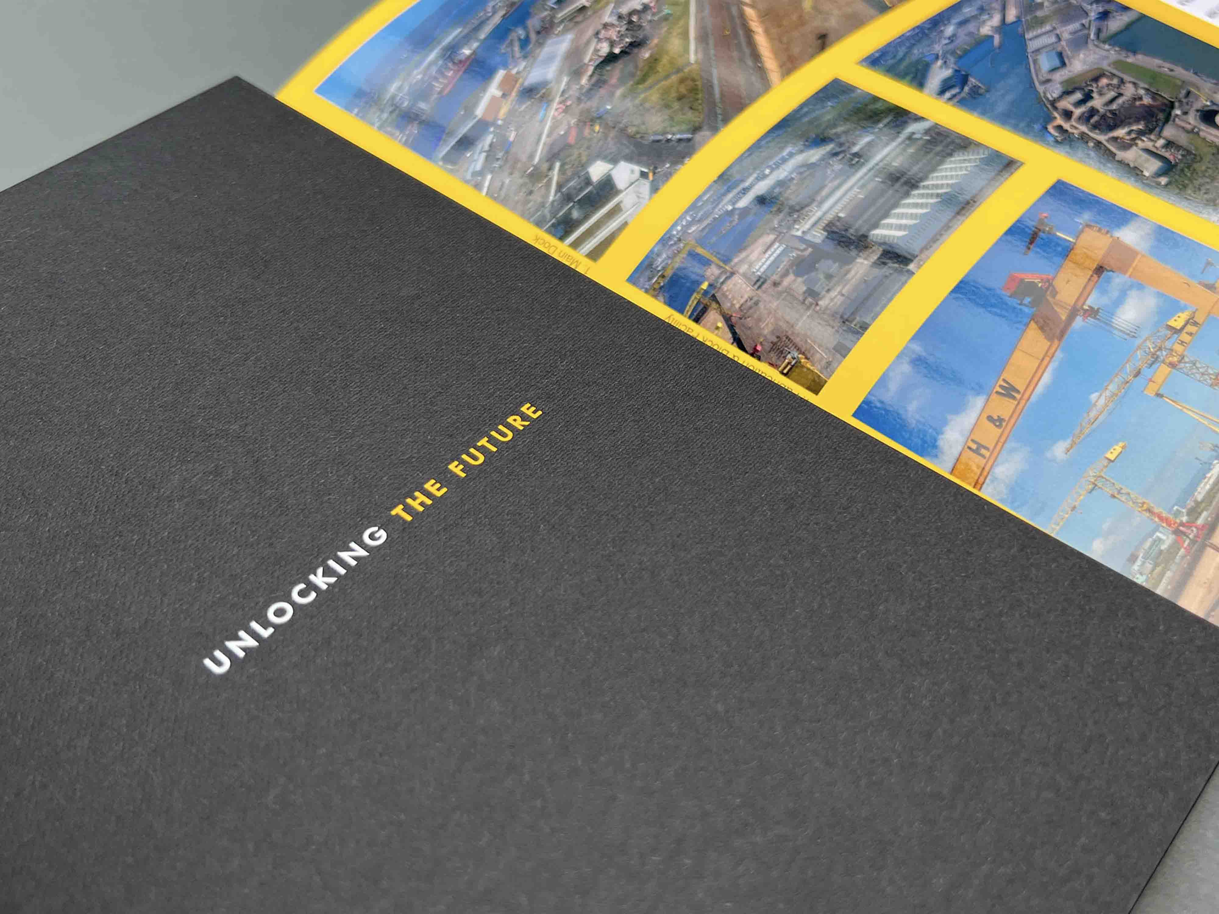

Annual Report & Accounts — concept, design and template
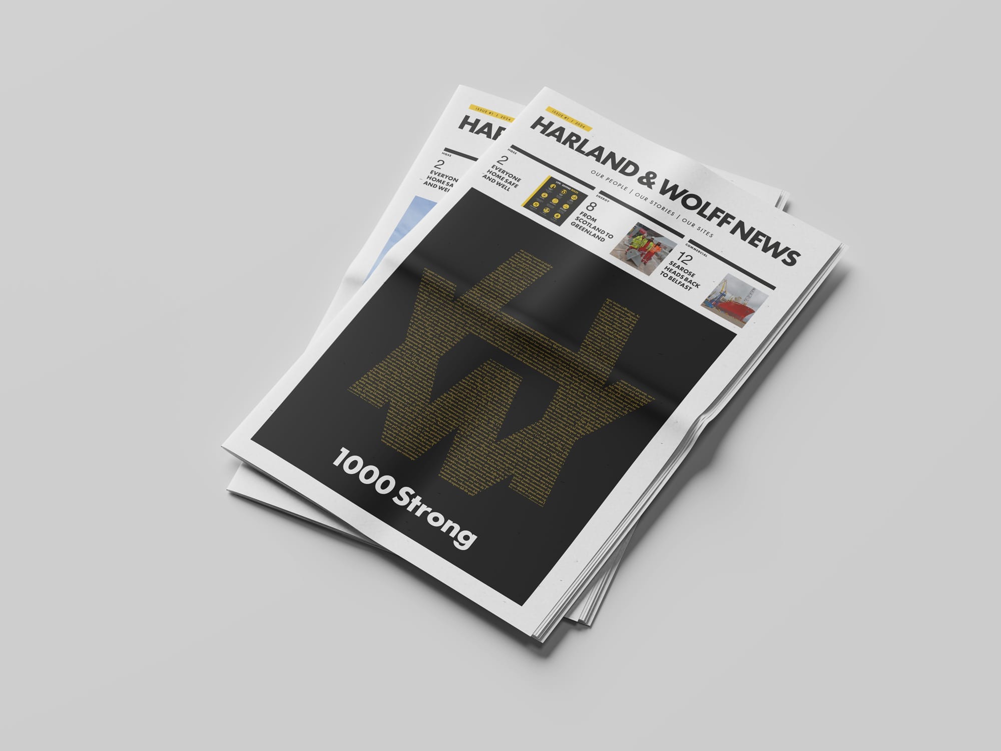
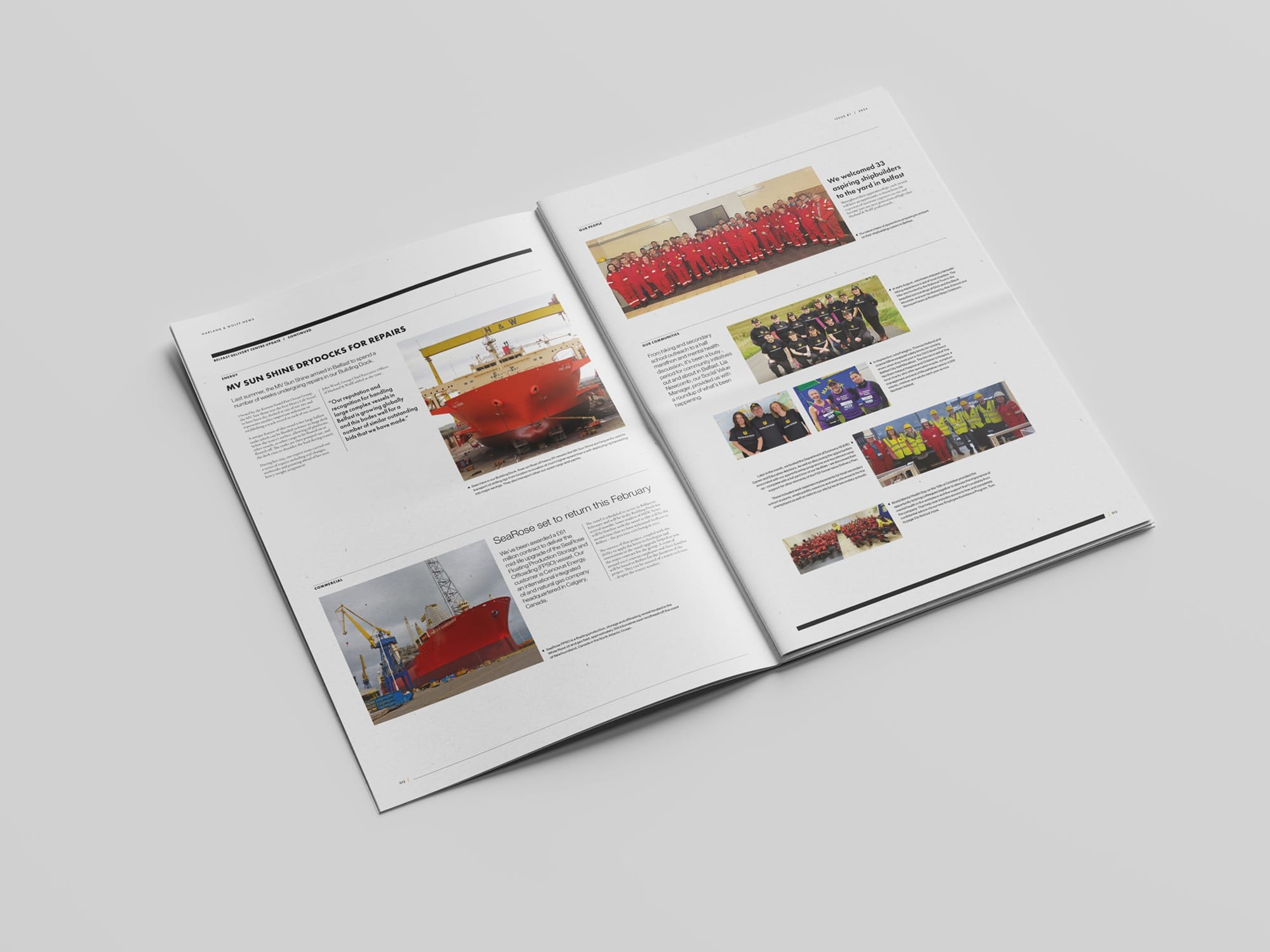
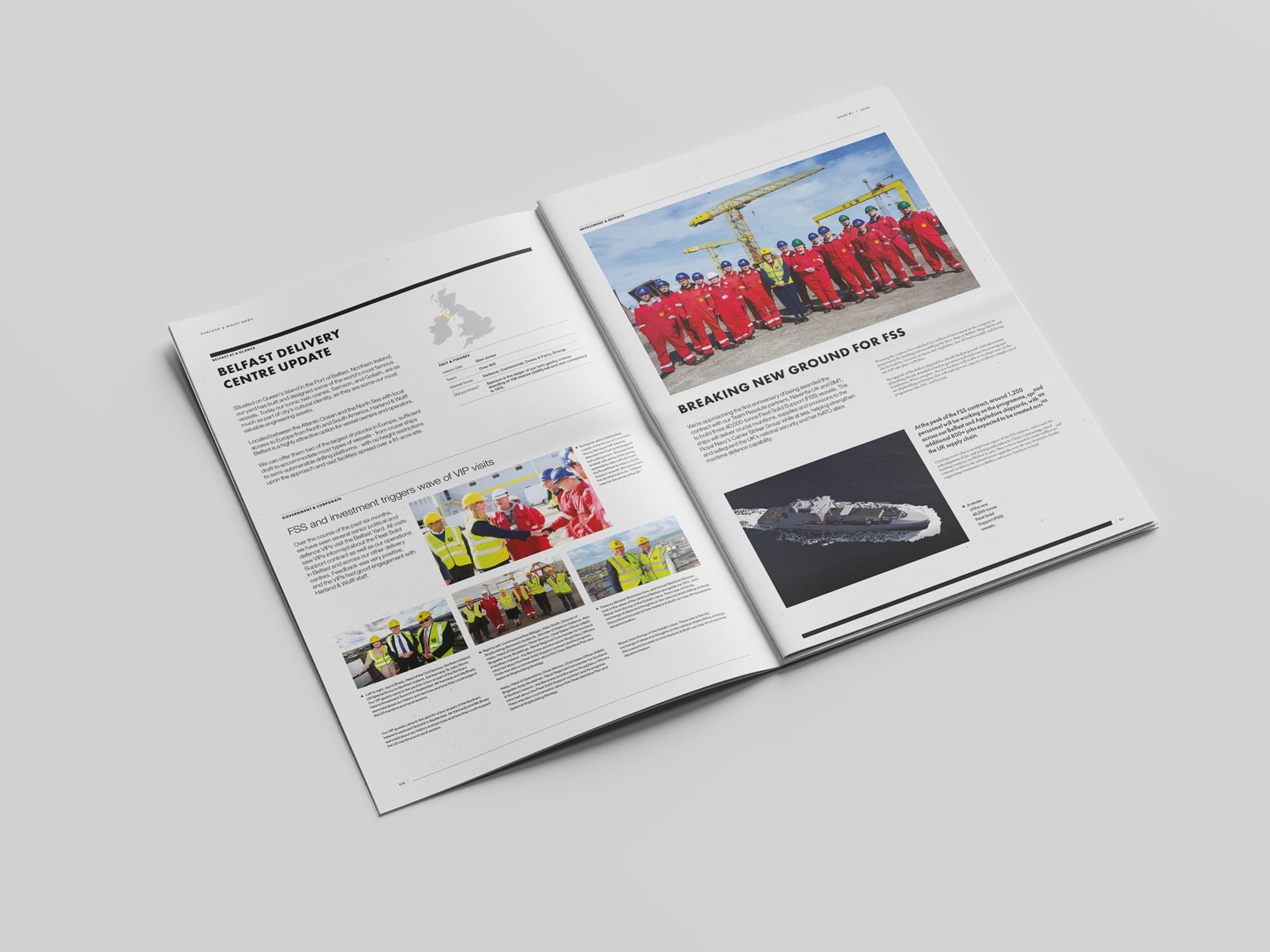
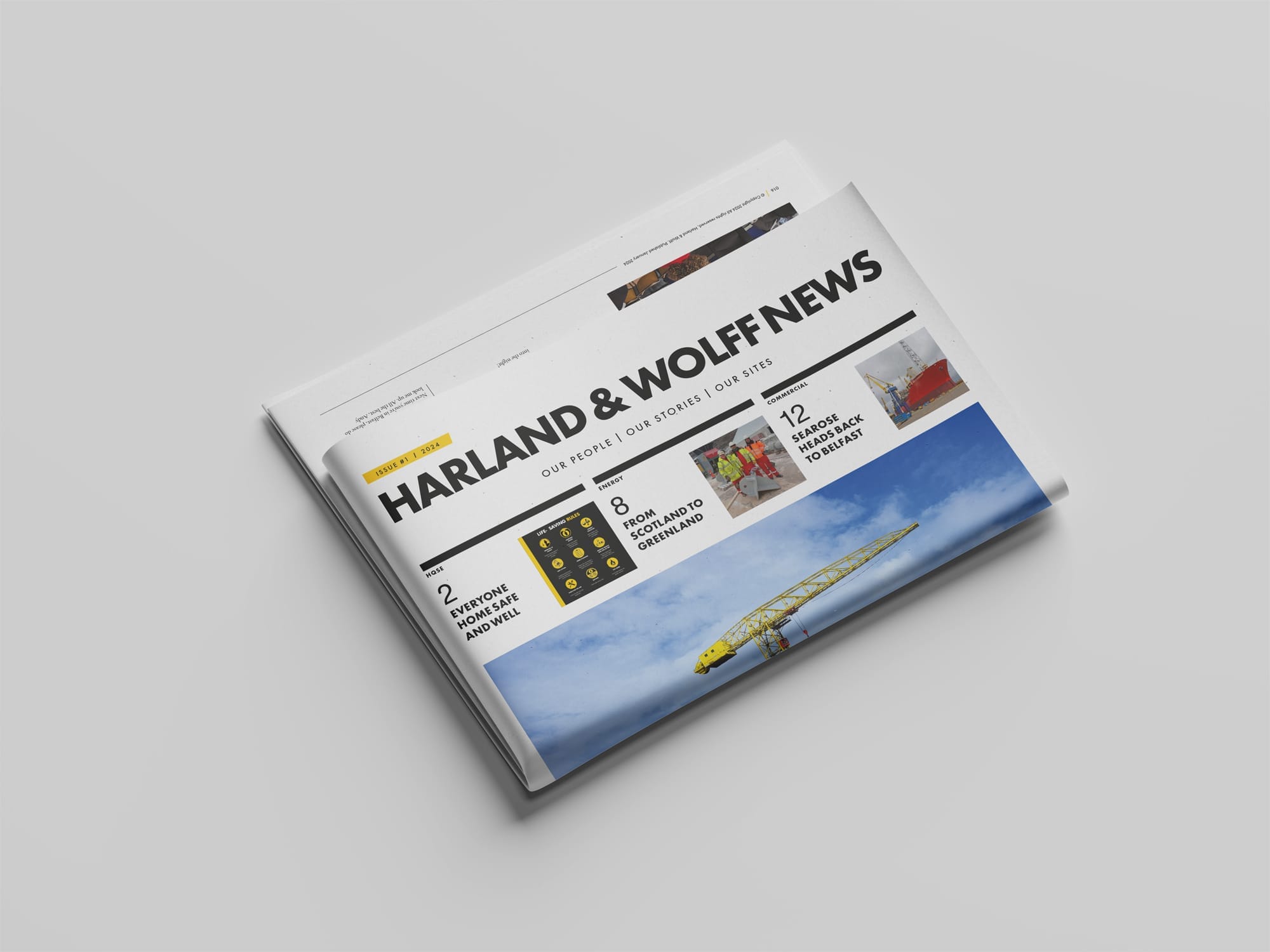
Employee communications. To kick-off 2024 we brought back to life a historic shipyard periodical used to communicate with the H&W workforce in the decades before. We developed a modern grid based on a tabloid format for 'Harland & Wolff News'. From celebrating the 1000 staff milestone (names designed into the H&W monogram on a poster pull-out concept within) to local updates, employee profiles, health and safety reminders, to local community engagement, it was printed and delivered across all 4 shipyards as well as their regional offices in London, Southampton, and Fort Lauderdale in the USA.


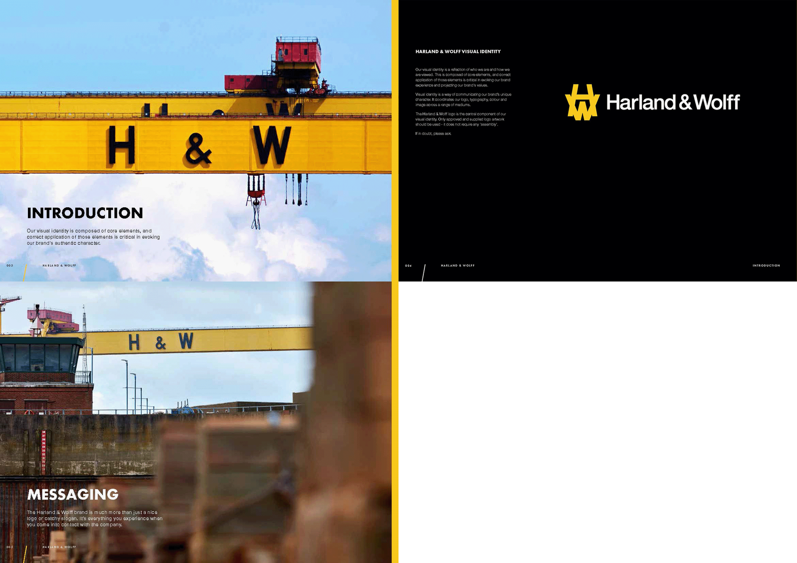

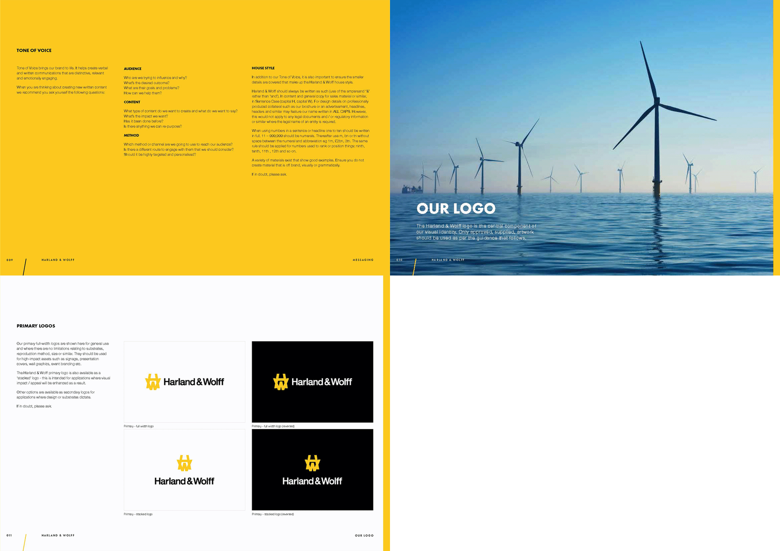
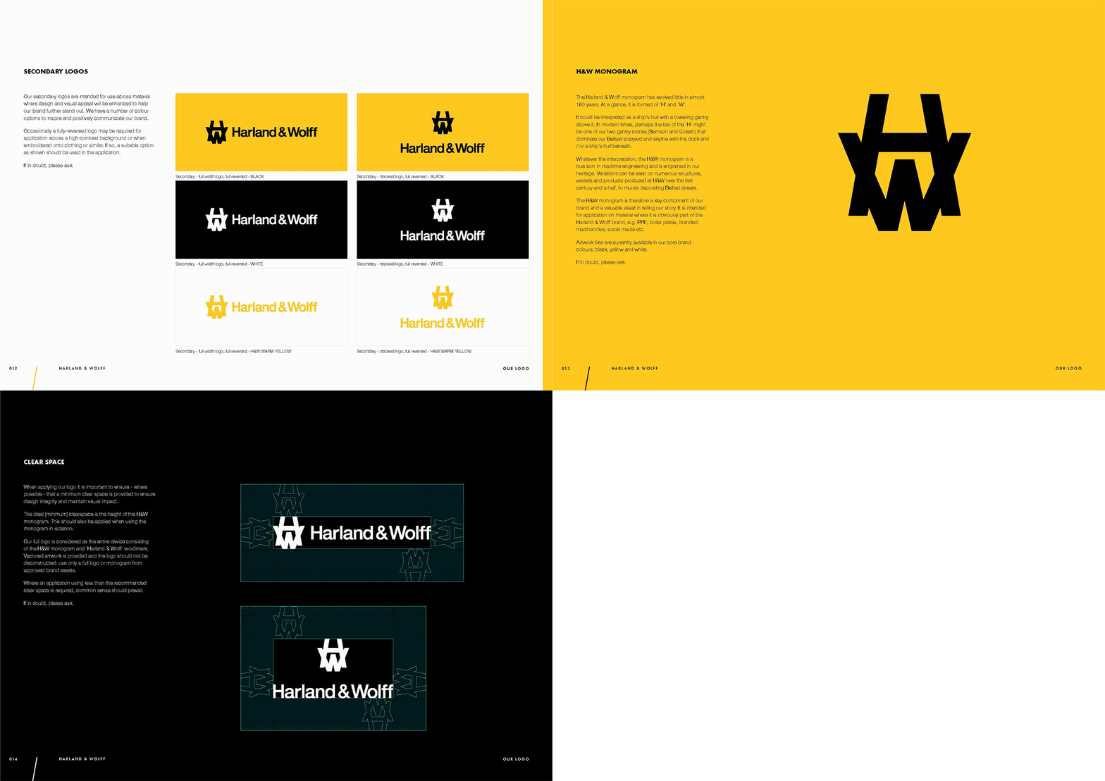


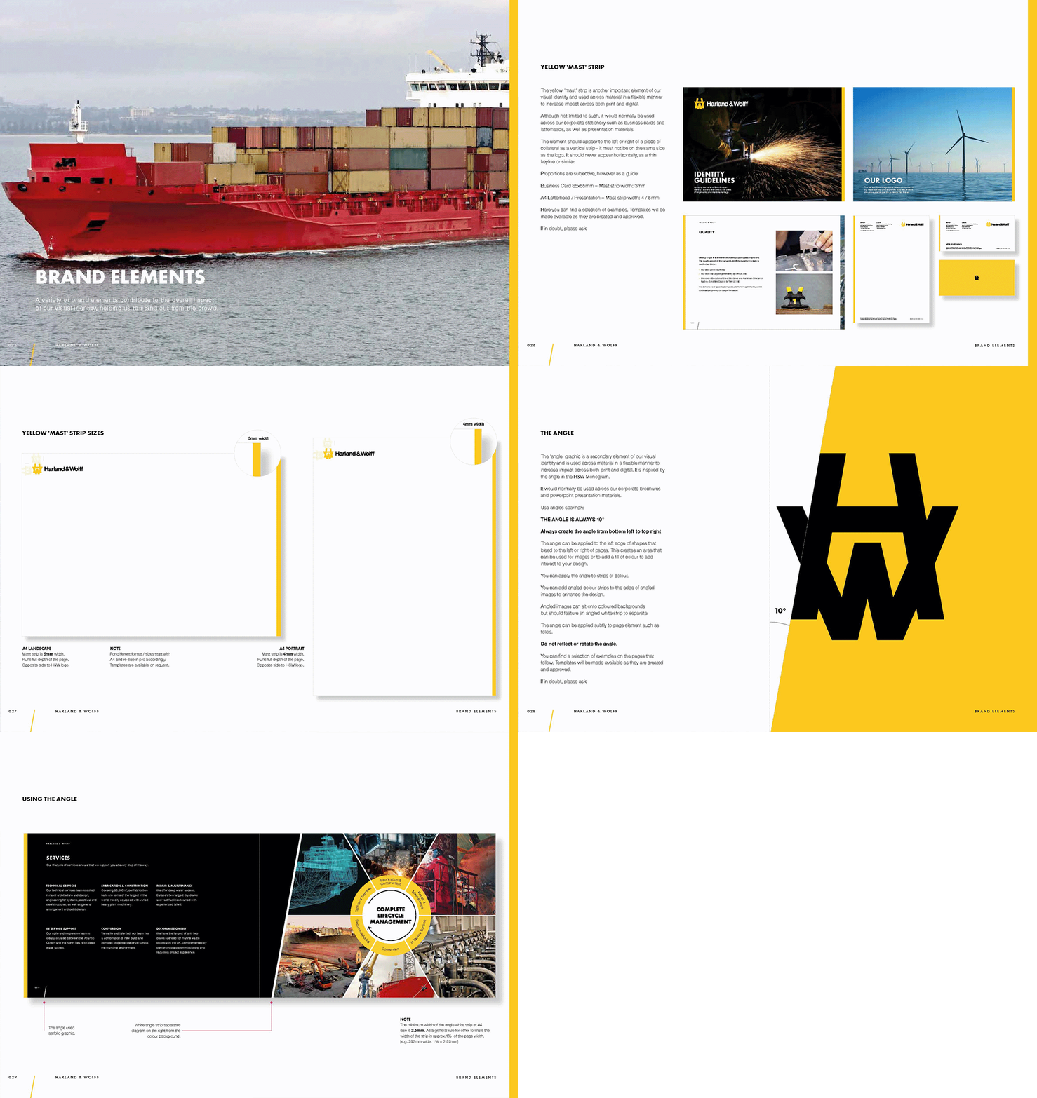
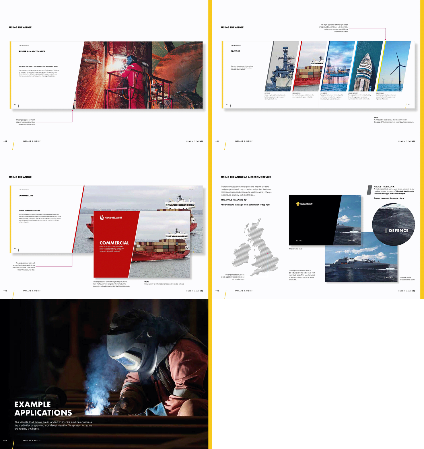

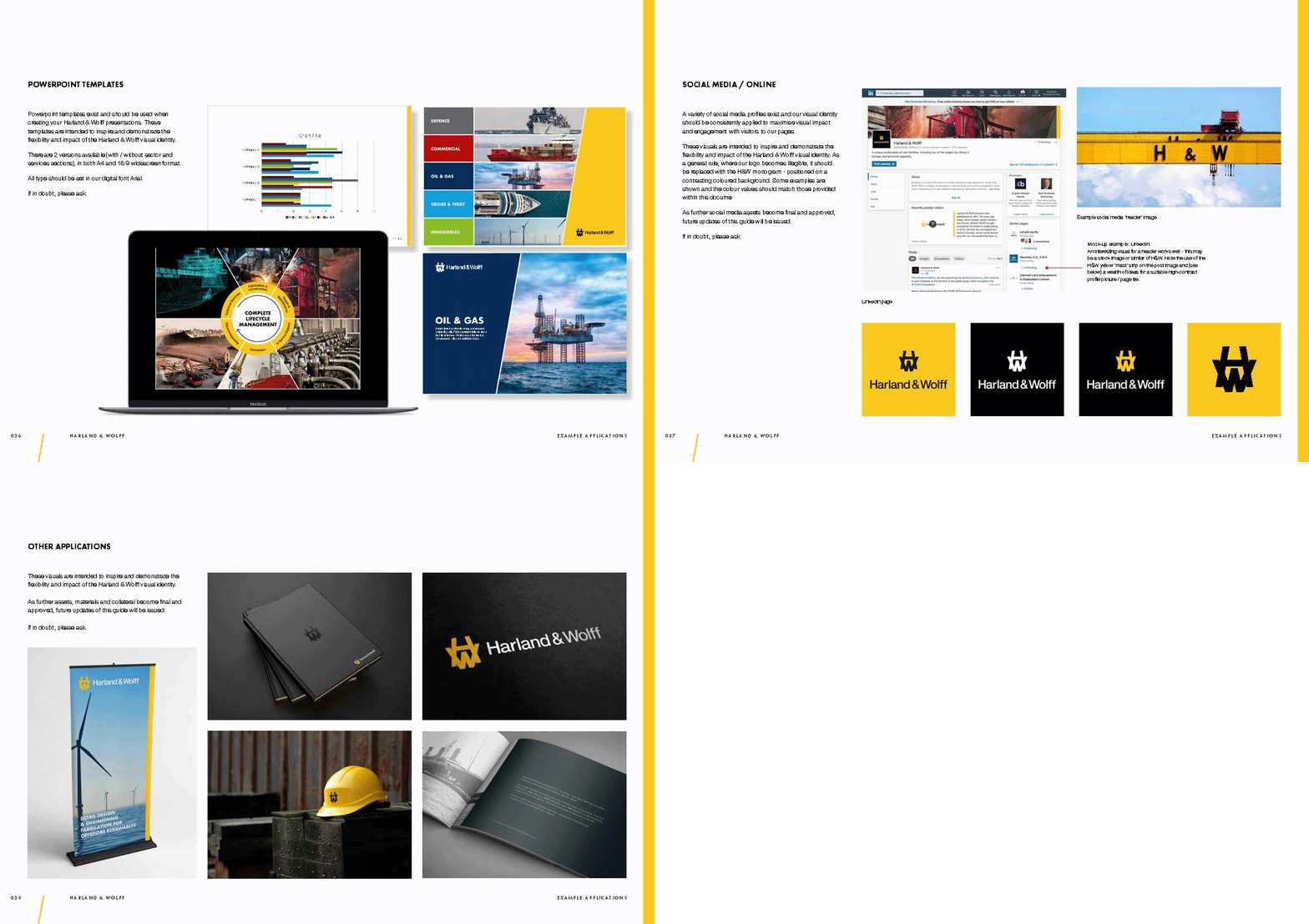


Rules and tools. Identity guidelines evolve with any freshly launched brand as it continues to grow. Our modular approach covered all the usual rules and tools, further enhanced by the delivery of an online brand guidance portal to assist internal teams and partners. From typographic treatments to the specific shade of yellow, rich black and Pantone references, the introduction of the H&W 'mast' and 'angle' as a creative application to standout in the crowd - none were designed by coincidence. Each recommendation and detail of the overall identity and design system was conceived by our team, tested and evolved, before being included in the final guidelines and rolled out.


